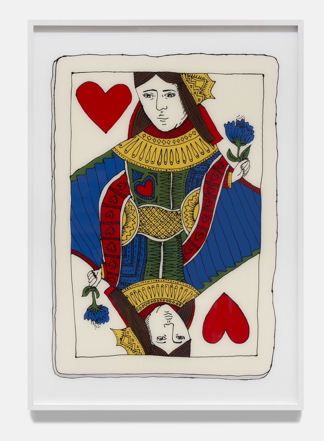
sweetpolka

Super Natural: Billie Justice Thomson

anna zagalaComment

Hospitality has always been important to Billie Justice Thomson.  Creating welcoming conditions – a warm and convivial space, filled with tunes and people who’ve gathered to share a home-cooked meal– is a ritual as ancient as human society itself.


It’s a disposition that requires a special kind of largess – a generosity of effort, resources, time and spirit. Nerves and meanness are its enemies. Success hinges on the capacity to experience sociable pleasure, nothing more, nothing less.


Billie Justice Thomson makes a virtue of conviviality, finding in it a principal and foundation for a life well lived. And her art practice extends this personal philosophy as a study of appreciation for things collected, shared and remembered. Her artworks of delectable objects – mostly gleaned from the pantry and garden, fishmongers, wine shops and milk bars of old – are scaled up for closer observation, and reverse painted on sheets of clear acrylic so that they float in a space of fascination. The process of reverse painting itself speaks to this contemplative disposition. It begins with the artist’s distinctive black outline, with multiple skins of colour layered in from behind to create images that glossy, sleek and rich in pigment.


In Super Natural, Billie Justice Thomson’s latest series of paintings, the artist has assembled nasturtiums, caperberries, a tomato, a fresh bunch of kale from the weekly vegetable box, and several varieties of oysters. Harking back to historical botanical illustrations used to identify plant species for medical purposes, Billie Justice Thomson’s studies fill the field of the painting with an attentive liveliness. (Such attentiveness should come as no surprise. Alongside a visual arts practice, the artist has worked as an in-demand illustrator for commercial clients, training her eye and developing drafting skills for the past decade.) In the paintings of the oysters that liveliness is amplified by their metallic sheen. That the paintings contain both faithful observation and a freaky vibrancy is a form of witchiness itself and accounts for their sense of potency.


The artist often begins the process of planning an exhibition with a list of items that will eventually form the subject of her paintings. In the final selection, a process of deliberation that sees some objects included, others discarded, possibilities emerge around what is happening between the works and what the grouping suggests. Pivotal in this body of work is the appearance of the Queen of Hearts. Her presence in the exhibition frames this body of work in a range of ways: alluding to play and card games, paganism, and as a powerful symbol of femme energy. 


And while Billie Justice Thomson’s paintings are of inanimate objects, perhaps their most beguiling quality is the way they invoke so powerfully the social realm. Circling back to the idea of hospitality – after all, what is all this beauty and bounty if not to be shared – Super Natural is a paean to simple pleasures and living with zest. Not only does it remind us to savour, truly savour, the seasonal rhythms of the garden and the bounty of harvest, but to pay attention to the quotidian. The art of Billie Justice Thomson is an invitation to observe what brings us sustenance, maybe even what lights us up.

Super Natural: Billie Justice Thomson
12.4.2024 — 24.4.2024

North Gallery,
Upstairs
55 Gertrude St, Fitzroy 3065
Melbourne
Australia


Review: Anatomy of a Fall

anna zagalaComment

Zero is the loneliest number. This crossed my mind searching for critical reviews of Justine Triet’s Palme d’Or winning French film Anatomy of a Fall this week and precisely finding none. I was urged by literally everyone in my orbit to see it, the recommendations arriving in person, by text and over the din of the phone set to speaker while driving. I’d absorbed the topic from these conversations given I started confusingly asking Siri the session times for Anatomy of a Marriage. And the film’s title and explanatory poster once I arrived at the correct film – a lifeless bloodied body with a huddled pair to the side calling in emergency services – augured well. Was it an accident, murder or death by suicide? The only witness, the luckless victim’s vision-impaired 11-year-old son.


What can only be described as a cautionary tale about rural isolation, professional ambition and drinking alcohol with lunch, the utter silliness of Anatomy of a Fall begins with a cranked-up cover of 50 Cent's 'P.I.M.P. played on repeat in the film’s opening scene, and finishes with a fanciful French courtroom trial in which a rhetorically flamboyant prosecutor and defence lawyer hammer out the nature and specificity of this unhappy marriage in three languages supported by bootleg tapes of their fights.


I’m not down on it for being so unapologetically “European Arthouse”, shorthand for a style of filmmaking with a lot of dialogue about serious subjects in bourgeois settings, though as the kids say, I did find it triggering.


So many revolting fantasies course through this film. The most offensive is the view that disability – in this case, Daniel’s blindness after a childhood accident – is a tragedy from which it is impossible to recover, certainly not the parents who can’t get past it, or the child for that matter, judging by his mopey friendless life in which avoids the misery of his parents by taking his dog Snoop for a walk. Daniel insists on attending the trial, gazed upon balefully by his mother in the stand, who is sorry, not sorry, he is learning the sordid details of his parents’ relationship in the stadium environment of the courthouse. Rather than offering protection, immature adults are gratified their children can really “know the truth”.


With little tenderness, kindness, connection or warmth between family members in the home, the striking absence of emotional intimacy turns into court mandated avoidance as the film progresses. I’m not certain why this is so distressing except that in inverting public and private domain so fully the film achieves a rare bleakness  ameliorated only by the reassuring presence of Snoop.


The terrible issue eating away at Sandra Voyters and Samuel Maleski’s marriage is creative frustration and a sore lack of professional recognition for one of the individuals inside it. Anatomy of a Fall’s view which the film reinforces through this binary of professional success and failure is that an “actualised” life is the only one worth living. Little rang true except the inevitability of this conclusion.


Conversation // Brianna Speight

anna zagalaComment

Brianna Speight is an emerging artist based in Tarntanya/Adelaide, South Australia. She works primarily with photography and is interested in gender issues and post-human feminism. Her layered photographic work sees soft textile surfaces interacting with the body, and various objects suspended in compositions that emerge through staging techniques and photomontage. Brianna completed a Bachelor of Visual Art specialising in Photography (2016) and Bachelor of Visual Art & Design Honours (2017) at the University of South Australia, Adelaide.

Anna Zagala: I'm sitting here in Brianna's studio with Brianna. It’s an overcast, summers day, and it's been about a month since So remember the liquid ground, has closed at Post Office Projects in Port Adelaide. So, at this juncture, the one month point after the exhibition’s closure, we've come together to have this conversation about that exhibition, and the works on display. I thought I would start by asking you, Brianna, how this exhibition even came about and how was it that you got the opportunity to show [at POP].


Brianna Speight: POP is a volunteer/curator run gallery and they put out a regular call for exhibition expressions of interest. I was coming off the back of my British School at Rome Residency in 2022, and really wanted to lock in a show where I could build on my ideas, make new work and present it. So I put in a proposal. That's kind of where it started.

AZ: How much time did you have to prepare for the exhibition?


BS: It was about a year. 


AZ: That's a significant length of time.


BS: Yeah. It was great amount of lead in time for a solo show. During that time, I’d lined up a residency at George Street Studios to learn new skills in metal work which tied into the proposal for the exhibition. I wanted to explore photography and sculpture, and work through alternative ways to present ideas I've been working with.


AZ: Working with photography, and sculpture and introducing metal work sounds daunting. [laughs]


BS: You know, when I'm making the photos, there's always this kind of scene that I'm building, this space of play, and you're in relation to objects working with lighting, depth of field and the shutter speed to compose the photo. I really wanted to extend the relationship with the materials I'm working with and think about how to draw out some of those aspects into the [gallery] space for people to engage with. But I didn't want to just take objects from the photos and have them in the room because it feels like it somehow compromises part of the magic or illusion of the images.


AZ: My first impression of your work is how much it reminds me of schlock horror and 70s and 80s TV. There’s a real sense of Jim Henson, a sense of something very imaginative and a little feral. How do you go about that process of making your work? You describe it as prop-making and set building. What is it that is guiding your decisions around making and what goes into that scene?


BS: In building the scene, there's a concept I’m working with. In this project I was really interested in the history of drainage in the southeast. It used to be mostly wetlands, and there's just been this kind of mess of ecocide there. I really wanted to connect a relationship between our body and these water systems. I spent some time in the Southeast photographing drainage sites. I laid those images onto material fabrics, which is what you can see behind you there [Brianna gestures to the hanging fabric behind Anna]. That became the backdrop for the set. I'm conscious of the kinds of materials used in photographs, I love soft and luminous surfaces because they can evoke bodily skin-like feelings and create movement or tension. Then I photograph myself with a timer or collaborate with performers, to create an interaction between the body and material that turns into these strange theatrical interactions. The gestures of the body, and what they elicit is important too, for example in one work, I was thinking about protective postures and showed this with a body curled up and the back turned towards the viewer.


AZ: That’s remarkable thinking about theatricality, not just being in terms of setting but also in terms of the human form.  The history of theatre and the human body on stage is about gesture. What was it that drew you to this idea of evoking a sense of protection?


BS: I guess it relates to ecological issues. And it wasn't that this idea of protection was a central theme in the work, it was just something that emerged as I was exploring how different gestures could convey feelings related to loss of biodiversity, and the sadness of that. Also, I started working with clay last year just as a fun side project. And that crept into the exhibition. I made these little pink millipedes into spiral shapes as they curl up when they're protecting themselves. When I visited a saltlake in the southeast, there were all these dead millipedes frozen in pink salt. And I guess that's where they first came into the project, and I started making these little pink millipedes curled into protective spirals.


AZ: It's almost like the realm of the uncanny, the thin line between protection and death. The curled millipede can be a dead millipede or in a protective state. It's got a shimmering quality that life has, a sort of sadness or something.


BS: I kind of lean into that.


AZ: What's interesting for me is that this project is born of that feeling of concern, even states of sadness, but the work itself is really playful. There is an element of tremendous imagination that's generative rather than, simple disquiet. It's got a sense of possibility.


BS: Thank you. That's a generous reflection. The project indeed stems from a sense of wanting things to be better and starting with that concern allows me to work and think through various emotions. Something that kind of came through the work for me was a sense of wonder in the cycles of life and the kind of iterative nature of things. In that, I felt a sense of possibility and optimism. As part of the project, I started speaking to ecologists working in wetland restoration and it was really interesting hearing about their efforts to re-wet the land in the Southeast. So there’s a mix of this concern, a sense of material play to explore emotions and a desire for a more hopeful future.


AZ: Thinking back to that moment where you're at George Street studio, and you're embarking on this investigation of photography and of sculptural form. What did that look like for you? And how much time did you set aside to sort of explore different possibilities? And how did you know when you maybe arrived somewhere.


BS: The George Street residency started in January and the show was scheduled for November which felt like a short amount of time to learn how to work with metal and present resolved work! I experimented a lot and tried to create a manageable scope for myself in the metal studio. I started working with thin metal rod I could twist and weld. I built structures that were light and I really love the line aspect of this thin metal rod [picking up an twisted object nearby]. It can bend quite easily. I started experimenting with ways that this could interact with the photos. It felt like it was like a first date or something [laughter] like I was making like this over here, then making this over here and thinking about how can –


[in unison] bring them together.


BS: I printed photos on aluminium and experimented with cutting shapes in the photos, but they felt too precious. Having gone through this intense process of staging and performing I decided I didn't want to disrupt them too much. So I started considering how the thin metal rod could work as cradles for the photos or as sculptures on their own, alongside the [photographic] work. There was some degree of success in the exhibition as to how they could work together. But it was very much something new for me and something that I'm still exploring now.


AZ: Integrating them even more.


BS: Yeah, I will keep working on this, it feels exciting. It was at times a challenge working between George Street Studios and developing a photo series, simultaneously. They felt kind of separate. But through that process of exhibiting, it's enabled me to practice intensely and explore how the two processes can be more closely connected and how audiences interact with the work.


AZ: The form is very evocative of root systems, or biomorphic forms. Tell me, what is that surface treatment?


BS: It’s polyurethane rubber with green colour pigment added.


AZ: It feels like quite bodily. Mucousy


BS: Yes! phlegmy.


AZ: Can I ask you about that? The sense of the body in your work? The environmental aspect is really upfront. You can feel that when you're in the presence of the works. What is it about uncontained, fleshy, and seeping body that appeals to you?


BS: Yeah, I just feel affected by it. To go back to the earlier question about the forms of the sculptural works. They come from maps of the drainage system, a pretty extensive drainage system that takes lots of water out to sea. It’s controversial because while it means farmers can farm their land it has also had this devastating impact on the ecosystem and water table. I drew from the topographical map of the drains, which looks like it could be a root system, and then translated them into 3D forms. I was considering how we're not separate from nature, but a part of it, and how this removal of water has impacted our lives. I imagined this in terms of sickness, and that's where I landed on the funny, disgusting phlegm. I was also inspired by reading Bodies of Water [by Astrida Neimanis] who talks about how all our waters are connected. I first encountered Neimanis’s work through Rosi Braidotti’s text Posthuman Feminism, which has also been a touchstone for me in developing this work.


AZ: That really comes through. It sounds like reading is important. Do you use it as a starting point or something you return to? What is the role of texts for you?


BS: Reading is really important to me, and texts play a big role in developing my concepts for a project. Philosophical texts help to unravel ideas and break down complex topics. This kind of really helps with mapping a contextual framework or position to approach making. And then you think with that while you’re making.


AZ: Kind of an anchoring?


BS: Yeah. Absolutely. I think of texts and particular voices as anchoring points in my process.


AZ: Coming back to POP and your show. I thought it would be a nice place to finish to ask you to reflect on what the experience was like for you to install your work and then view it as an exhibition.


BS: It's exciting to consider people engaging with your work and ideas and equally daunting. But also it's fun to be in the exhibition space figuring out how to position works. I was asking How can people move around them? and How can they actually be installed? At POP the walls are comprised of various materials, so it was an install challenge in that sense. But yeah, then there was the fun of the materials and having little millipedes to play with. Also! Showing alongside Danny Reynolds was wonderful. During install we kept missing each other, but could see each other’s shows go up slowly, chatting over Instagram and asking about artwork placement. The day before the exhibition opened, we finally met in person, and it was really lovely. And we just basically talked about how stressful it was. [laughs]


Brianna Speight: So remember the liquid ground
22 November – 16 December 2023

Post Office Projects
175 St Vincent St
Kaurna Country
Port Adelaide 5015
South Australia

KNOW HER NAME

anna zagalaComment

Marie McMahon

In 1981 Marie McMahon was on a camping trip with the mob on Tikilaru Country on Bathurst Island when their car came head to head with a four wheel drive on a narrow bush track. Inside were two business men from Darwin. They were on an expedition to investigate opening a tourist resort on a nearby beach. McMahon’s companion and a custodian of the land, Winnie Munkara, leapt out of the car and angrily confronted the pair about their right and claim to the land.1

That event remained in my mind as a demonstration of land ownership from an Aboriginal perspective. The experience of being on Aboriginal Land in the company of Tikilawula (people of Tikilaru) gave me a greateer understanding of the meaning of the Australian landscape.2

This charged encounter became the basis for the now iconic Pay the rent: You are on Aboriginal Land poster. To make it McMahon drew on her archive of photographs, selecting a photo of local woman, Phillipa Pupangamirri, taken on a previous trip to the Island. She borrowed the slogan from a car bumper sticker that had been popular in Townsville at the time and illustrated the composition in her characteristic decorative illustrative style. 

McMahon hand screen-printed the first version of these posters in an edition of 30 at the Redback Graphix workshop in Wollongong that year, followed by a second run printed at Lucifoil Collective (operating out of the defunct Tin Sheds workshop facilities) in 1982. A subsequent version with ‘Pay the rent’ omitted were commercially printed in quantities of 1,000 several times over. As the artist explains:

The words Pay the rent didn’t reflect the world view of Aboriginal people living in their own country and on their traditional lands. What did it mean? Wheras “You are on Aboriginal land” was a matter of fact.

Screenprinted poster collectives were a vital part of the ecology of local communities in Australia between the early 1970s and the late 1990s. In that time more than two dozen workshops opened and closed their doors.4 Artists – or art workers as they preferred to be called – often travelled back and forth between these turpentine soaked spaces across state borders and cities as well as remote regional areas connected by activism and a web of social relationships.

These collectives, which sprung up as part of universities and community centres, gave witty, gritty, vibrant graphic expression to urgent causes and social movements of the time such as women’s liberation, gay and lesbian rights, Aboriginal rights, insecure housing, environmentalism and nuclear disarmament.

In an ideological stance poster collectives resisted the commodification of the posters as art objects; the artworld was viewed suspiciously as the domain of the cultural elites. The commitment to collectivism extended to methodology. Posters were printed in multiples, often designed by consensus and as a matter of course, attributed to the workshop rather than individuals.

Furthermore, posters drew on multiple voices, vernacular culture and a shared archive: photos, books, comics, textile patterns, magazines, stickers, newspapers, long conversations over the phone and letters which were then relayed, deployed, repurposed, cut and collaged into four, five, six stencil prints.

It’s now commonly accepted that we are on Aboriginal Land. The acknowledgment made publicly at gatherings may seem commonplace but it’s a relatively recent occurrence. It’s the work of countless pioneers like Marie McMahon who worked to affect social change.  

Endnotes:
1
2
3
4

HARI KOUTLAKIS: CALL AND RESOPONSE

anna zagalaComment

For the artist communication with nature remains the most essential condition. The artist is human; himself nature; part of nature within natural space.
- Paul Klee, 1923

In the energetic paintings of Hari Koutlakis lines move like ribbons across the canvas.

The movement in Hari’s paintings brims with vitality, as though the line is itself a life force, animated by unknown and unconscious forces. It is a line that resides in the awareness of the kinaesthetic body, in muscles, and tendons, in motion and stillness.


As a child Hari studied the Afro-Brazilian martial art capoeira which combines elements of dance, acrobatics, music and spirituality. Participants perform aerial somersaults, marked by graceful, fluid, and often acrobatic movements in which practitioners confront one another in improvised encounters, using gestures of call and response.


The preparation that goes into capoeira carries into the painting practice, which is systematic. For this discipline, Hari draws on mathematical measurements as a necessary coordinate. Then the hand, as the modernist painter Paul Klee would say, goes for a walk.


The hand moves freely, as though automatically, outside thought. It is oriented toward the unknown. It arrives somewhere alive, biomorphic.


It is a line that carries somatic memories and experiences: of the ocean and forest, sunsets, and sunrises, urban buildings, and concrete.


Where the rhythmic lines intersect, they form a positive and negative space and, in the process of inverting, a surface. That surface is taut as a drum, yes, but it is also porous, like a threshold or a portal.


Hari’s immersive exhibition, where the artist has painted all four surfaces of a room (floors, walls and ceiling), is in fact Hari’s second iteration of the work. Originally Hari painted a smaller-scaled version, of his bedroom many years ago. Pulsating like a warping, vibrating, monochromatic, and hallucinogenic passage it transports us, but to where?


No matter. In its patterning and infinite complexity, it invokes the cosmos, the universe itself, our celestial home and life-long habitat.


 With apologies to Jaques Derrida and Gilles Deleuze and thanks to Stephen Zagala.

Hari Koutlakis
Move Like This
24 February - 5 March 2022
Goodbank Gallery
Mc Laren Vale


COCCOON MOON: BRENDAN HUNTLES & EMILY FERRETTI

anna zagalaComment

spoken 

When my firstborn was still a baby we moved to the suburb of Alphington. Our local park, adjacent to the oval, was so woeful at the time it topped the worst playgrounds of Melbourne list that someone had compiled and posted to the internet. It had one tree, a mature gum tree that in summer provided a sense of sanctuary even if not much shade. I’d push the pram there each day and place Otto into the stiff bucket and swing him back and forth, his view oscillating between a sea of tanbark below and the sky above. On one of these visits, Otto turned to me, pointed his pincer finger at the pale round moon in the sky and said “moon.” 

It was his second-ever spoken word. How did he know it was the moon rather than the tanbark that mattered? 

*** 

There are four stages of the moth life cycle: eggs, larvae, cocoon, and adult. 

*** 

parallel play 

Between the ages of 18-24 months, toddlers learn to parallel play, a form of play in which they occupy space adjacent to one another, sometimes observing, and occasionally interacting but without seeking to influence each other. Importantly, everyone is playing, no one is watching. This developmental stage of play is significant in shaping the skills and capacity for social play which follows. 

*** 

lunar cycle 

I drive Otto on the weekends between music lessons and work facilitating some form of skill development. Here I am in the world, moving around with purpose, generally unobserved, my time is not especially my own but the way I spend it is of my choosing. Mostly I like being in motion and enjoy the sideways conversations which can be very funny but also laced with criticism and thinly veiled hostility. What I am describing is essentially the definition of obligation. One day I won’t be needed this way. 

The moon above always reminds me of this fast-approaching moment and its unavoidable truth. 

*** 

a mirror 

I follow a lot of baby and toddler accounts on Instagram documenting the exploits of twins. I am a twin, an identical twin, and I’m unfailingly moved by small people in relationship to one another. One of the earliest photographs of the two of us shows us seated side by side, indistinguishable from one another, and we think me pulling on my doppelganger’s ear. 

Until recently I would stop parents out with their twins and share that I was a twin and point out their great fortune. Sounding like Whitney Huston, I would opine, it’s the greatest gift, being born a twin. 

pulling the print 

A monotype is a unique print, made by applying oil-based paint to a flat sheet, and in this instance copper. The painted image is pulled through a press and by that application of pressure, the image is transferred to paper. The paint itself is applied to the plate using two methods: the additive, in which oil paint is applied directly to the plate often using a brush, and the subtractive, in which the plate is covered with a layer of paint, and the image is formed by manipulating and removing the paint using tools, including brushes, rags, or finger. 

It's a dynamic process, requiring speed and momentum, judgement, and intuition. The peeling back of the sheet and plate is a process of separation that yields a metamorphosis. 

*** 

pressure 

Parenting is uniquely demanding. When you have small children any time away from them is experienced in a complicated way. In the ecosystem of the home, an absence of a partner is keenly felt. For the child, it’s also experienced as a pleasure and a state of tension. A parent stepping out the front door hears the clock and feels the pressure: to keep it short, to make it count, to be accountable. So long as your adrenal glands are not shot, in that pressured state, it’s possible to achieve a great deal. 

*** 

phases 

The eight phases of the moon are, in order, a new moon, waxing crescent, first quarter, waxing gibbous, full moon, waning gibbous, third quarter and waning crescent. The cycle repeats once a month. 

*** 

relational psychotherapy 

In psychotherapy therapists and patients work together to develop insight, into something previously unknown. That insight or discovery is not waiting to be uncovered like a bug under a leaf. It is co-created and co-discovered through interaction. This process generates new ways of not only self-understanding but new ways of seeing the world. 

*** 

vibrations 

Attunement is a process of acknowledging and reacting to another person’s inner world. In children, attunement with a primary caregiver creates a sense of security and safety. In adults, it cultivates closeness and connection. 

*** 

dovetail 

The three of us meet to review the prints a month after the residency. We sit around Emily Ferretti’s studio table sorting and moving the artwork into arrangements. In front of us lies a record of a creatively productive encounter. 

We mostly talk about raising humans: Emily’s twins, Brendan’s baby and toddler, and my teens. Between us the full spectrum of childhood. 

The monotypes bounce between abstraction and figuration. They are energetic and possess vitality, unapologetic in their directness and engage in playful candour. They share a vibrant palette and a loose gestural language. Lines in both artist's works zig-zag and loop, and individual motifs – a butterfly’s wings, the flutter of a falling leaf – dovetail into a glorious, harmonious cacophony. 

*** 

art is playful and play is social 

Like the motion of cranking the printer arm to rotate the roller over sheet and plate to apply maximum pressure, Ferretti and Huntley have produced a body of work that harnesses the movement that governs the universe – the sun and the moon, trees and clouds, moths and butterflies, and human faces. In their presence we are placed in touch with transformation and growth, the very process of becoming

Emily Ferretti & Brendan Huntley Cocoon Moon
28th – 30th April 2023 
Negative Press
Naarm/Melbourne

Dani Reynolds 'World's Widest Wig Work'

anna zagalaComment

Dani Reynolds' potentially record-breaking wig in Adelaide Contemporary Experimental’s 'Studios: 2022' exhibition. Photo: Jason Katsaras

Studios: 2022
ACE Open
November 12 2022 to December 17 2022

Studios: 2022 is a showcase of the diverse practices and work developed as part of ACE’s annual Studio Program – a fully-supported professional development opportunity for South Australian artists.

Guest curated by Megan Robson (Associate Curator, Exhibitions at the Museum of Contemporary Art Australia, Sydney), the exhibition features the diverse disciplines of the 2022 Studio Program artists, including photography, sculpture, installation, printmaking and performance.

Breaks and continuities: the grids of Anna Farago and Hannah Maskell

anna zagalaComment

Few formal techniques and approaches announce the arrival of modernism in art at the turn of the twentieth century as emphatically as the grid. As Rosalind Krauss writes the grid functions to declare the modernity of modern art in two ways, the spatial and the temporal. As a spatial arrangement the grid flattens, orders and geometrcizes. In a temporal sense the sudden proliferation of grid as a foundational tool of abstract painting in the early twentieth century renders it transformative. There was before – the nineteenth century, from which the appearance of grids in the visual arts were almost entirely absent – and then after. [1]

The underlying principles of early modernism and its associated art movements (Cubism, de Stil, Dadaism, Constructivism etc) celebrated change and movement: a rejection of history, an emphasis on experimentation with form in terms of shape and colour, and a belief in technological and social progress dominated cultural discourse for well into the twentieth century. By the 1960s abstract painting had its own distinct history, theory of practice, its critics, and its champions, and had achieved unequivocal institutional acceptance. Male artists were the face of the movement, though women artists such as Helen Frankenthaler, Agnes Martin, Hilma af Klimt, Sonia Delauney and Anni Albers, among others, worked alongside their male counterparts often with little public attention.

When I look at the present-day drawings, paintings and textile works Anna Farago and Hannah Maskell I reflexively look back to modernism and its practitioners, the celebrated and only recently recognised, observing its influence on contemporary art practice. Though the modernists wouldn’t like it, I experience it as a reassuring continuity.


I’m thinking about this before and after moment, the one we are living through, defined by the global coronavirus pandemic and how in the past two years it has reshaped geo-politics, working lives, home, and social structures.


Anna Farago and Hannah Maskell lived through the pandemic in the world’s most locked down city in which they, along with millions of others, were forced to isolate. They continued to make art throughout this period. The resulting work made by these two artists across 2020-21 unfolds like a conversation on the subject of pressure.


In Farago’s studies it’s as though the tumultuous world outside the studio door has been ordered and contained through a series of studies. In them the artist has paid attention to the intersection of lines, in compositions grounded in geometry (owing something to the foundational block form of quilting) and the exploration of a rich, harmonious jewel-like colour palette. These studies have further been elaborated and rearticulated into textiles through cotton and needlepoint techniques. Largely modest in scale, they make no claim for themselves other than a demonstration of commitment to process, repetition and the power of showing up for no one other than yourself.


Hannah Maskell’s drawings vibrate with intensity. Partly this is the effect of a vibrant hi-key palette but it’s also the result of skilful technique in which the artist distributes the pencil pigment across the page with a sure, consistent pressure. Similar to Farago Maskell’s work – both drawings and assemblages – use the grid as an architectural frame. The grid provides anchor points along which the line travels, points varying in spacing to control the degree of complexity and detail. The reference to textiles is unmistakeable however, in Maskell’s drawings and painted assemblages the rectilinear shapes, rectangles and squares, recall the linearity of thread, the weave of fabric, and the structure of a loom.

Anna Farago and Hannah Maskell have found a common thread as they make their way through these difficult days, a way through. It’s no small feat. So much is required to get anything done. These studies and small works are a testament to grit, to the judicious deployment of available material and psychological resources: time, space, commitment, and a capacity, not only to hope, but to endure. 

–  Anna Zagala, January 2022. 

[1] Rosalind Krauss, October, vol. 9 (Summer, 19779), pp 50 http:.//www.jostar.org/stable/778321. Accessed 11/1/2022.

Catalogue essay to accompany the exhibition Crossovers: Anna Farrago and Hannah Maskell, 19 January – 5 February 2022, Five Walls, Footscray.

Images: Sarah Treleaven

Writings (2020-21)

anna zagalaComment

Eleanor Zecchin: Serious Play - scenes for an imagined theatre

Spielraum is a German word.‘Spiel’ translates as play. But spielraum is a different concept, describing the idea of scope. It suggests that scope and its adjacent concepts of latitude, freedom and leeway are intrinsically linked to play. 

As a set of possibilities spielraum evokes with clarity a state of autonomy. From this point experimentation – with things and ideas – is possible. Spielraum could easily describe the artist’s studio, a space in which the artist engages in making through a process of experimentation with materials and ideas. To it she brings materials and tools: brushes and paper, canvas and clay, board and paints. She contends with their properties; from the porousness of paper to the absorbent surface of bisque fired clay. She works both quickly and slowly, alert to line, gestures and repetitions that develop and emerge from spills and splats like emergent life forms at the junction of the observed world and imagination.

The work requires attention to chance, a willingness to experiment and capitulation with happenstance. It anticipates nothing, other than the movement between action and observation. It’s a practice that takes practice. Maybe this is why it’s serious play. The discipline is the artist’s capacity to return to this space over again and re-engage in it: to step across the threshold of the studio and to encounter the material objects anew, reconfiguring relationships between maturing things and new thoughts.

Theories of play emphasise its role in developing language, social skills and imagination. Imagining anything involves forming a mental picture, one that draws on our memories and ability to form analogies and narratives. It is an action that primarily describes a relationship with our inner life – a psychic space that includes our fantasies and daydreams.

Imaginary fragments are the realm of fantasies and daydreams. They are also the foundation of narrative. We string imaginary fragments together and, over time and with work, these develop into scenes and sequences. Assembled together they constitute the form of a play.

We have arrived at the imaginary theatre. The etymology of theatre is Greek; the term comes from theatron. It means the people in the theatre; a show, a spectacle, a place for viewing. It comes from theasthai: to behold, relating to thea: a view, seeing: a seat in the theatre.

In the theatre the play finds an audience. As such it is the realm of the social, a civic space where play and imagination are transformed into a public proposition. If the analogy carries – and I think it does – to the gallery and the visual arts, what do we behold?

Eleanor Zechhin, Serious Play - scenes for an imagined theatre, POP Gallery, 08 August - September 2021

—————————

Same, same, different

In what is roughly an annual break from solo exhibitions this month Adelaide-based Hugo Michell Gallery has brought six artists together into a curated exhibition on the theme of domestic architecture. Noel McKenna, Eliza Gosse, Katherine Hattam, Kate Ballis, Elvis Richardson and Paul Davies are based in Sydney and Melbourne; two with strong ties to California. Only one, Elvis Richardson, is represented by the gallery.

Commercial galleries – or commercial contemporary art spaces – as they refer to themselves these days work hard to put a roof over their head and those of their represented artists. In the face of dynamic market conditions and fluctuating consumer confidence they are necessarily inventive; shows like this one are a case in point.

What of it if Going Home would be better titled Going House? Or that in-situ, through no fault of their own the selected works are casualties of obvious curating, look dull and flat?

I’m not here to kvetch. I live in a small regional centre and I’m grateful for news. That includes the opportunity to view new work shown in an environment of affable hospitality.

Aside from Katherine Hattam’s large canvases of vistas that situate the viewer inside looking out, works represented in the assembled paintings and photographs are building facades.

Noel McKenna’s front-on paintings of derelict, down at heel and time worn Queenslanders, including that childhood home of former Prime Minister Paul Keating, convey a sense a striking even, uncanny familiarity through a command of the vernacular. A curled cat on a brick fence is the sole sign of life.

Eliza Gosse’s slick paintings of mid century modern facades offer a reassuring blankness in which the building itself is tamed through a narrow tonal expression into a fetishistic interplay of surfaces and materials. The addition of a rear or side view of vintage and older model cars in each painting lends them a truly formulaic quality as though modelled on the instructions issued by a realtor.

Paul Davies is represented by a single canvas of an imposing two story mid century house framed by towering trees and their reflection in the swimming pool. The intricate paint surface is built up in icy pastels by the use of a stencil. Stately, imposing and isolated it celebrates hyper masculinity by utilising techniques – a colour palette, the decorative – historically associated with the ‘feminine’.

Kate Ballis, tucked away in a side gallery, has photographed the buildings around Palm Springs, California using infrared technology that renders the images in strong Barbie hues. The most directly commercial in appeal Ballis’ photographs of bessa brick walls, butterfly roof lines and hotel signage are eerily still, as though documenting a post human world. Death Valley, California, a mere 500 km away, recorded the highest temperatures on Earth last week.

Elvis Richardson’s powder coated candy pink gate is the one sculptural object in the exhibition. Its decorative curls and the word OCCUPATION and flags inscribed with the word settlement is both deliberately cute and cutting. Gates are a blunt marker of land boundaries. Fixating on the domestic scale, Richardson’s piece alludes, with a surprising degree of force, to historical processes of Aboriginal land dispossession.

The task for commercial galleries – presenting works for sale – can be at odds with what constitutes an interesting exhibition. Hanging same with same offers a clear directive to collectors but not necessarily to viewers looking for a thoughtful, engaging show.

In Katherine Hattam’s four paintings figure and ground appears collapsed – or expanded, if you like – into a psychological space where objects such as a phone, laptop, glasses and book titles are anchored by a window frame. The vistas hold a range of pictorial possibilities: language, native flora and fauna, water views that examine the contours of interiority. Hattam’s paintings offer a conception of home and place that acknowledges the life and forces of an ecosystem. It was a welcome, markedly different, perspective.

Hugo Michell Gallery , Adelaide, 24 June—24 July 2021, Published 29 June 2021, The Review Board

————

Brendan Huntley: Without Within


It’s only now with artists beginning to display work made during 2020 that we are beginning to gain an insight into the impact of the pandemic and the accompanying economic uncertainty, threat to personal safety, and restriction of movement has wrought on individuals.

For Brendan Huntley, a mid-career artist and musician of renown, it meant changing gears. In a practical sense, it affected the way that he worked; lockdowns necessitated consolidating two studio spaces – one for painting, the other for ceramics some distance away – to home base, an adjustment that has brought two parallel practices into closer proximity.

Huntley’s work has always drawn in found materials from his domestic and immediate environment and folded disparate influences into his work in a tactile and casual way. The ceramic sculptural objects that he’s made in the past from heads, to large vessel-like forms, possess an appealing talismanic charm and animistic vitality, summoning through their sheer object-ness the elemental forces of the cosmos and the spectre of ritual without being either pious or freakishly intense.

Huntley continues this approach in his current exhibition, Without Within. It presents thirty-six works on paper and accompanying ceramic sculptures, this time of moths. The insect is not only a symbol of transformation but a creature that undertakes its metamorphoses reconstituting itself inside a cocoon. This makes it a primo metaphor for 2020.

I was jazzed by the sight of the oil pastels, mounted in a 12 x 3 grid extending along the gallery wall. They are cheery, smeary, and energetic ‘portraits’ combining across the series both the repetition of the symmetry of the moth’s form: wings, abdomen, and antennae, while allowing for variation in expression that incorporates male and female biological markers, fannies and ripped six-packs, along with some funny little faces. Each one reiterates the face with the feature of an eye on each wing and a simple line for a smile. Messing up the plain and unapologetic directness is some complex and colourful patterning.

Between the works covering the walls and ceramic moths dotted on an arc of plinths, the gallery pulsates with waves, zig-zags, polka dots, straight lines, diamonds, and squares. While the patterning style recalls the textile loom construction, Huntley’s hand is loose injecting a sure, notational style. In the works on paper, he achieves sketchy, frenetic blocking of colour. The ceramic moths’ layer glaze patterning with the surface printing and the application of shapes and rolled clay.

Artists speak of influences, but viewers register associations. Freewheeling, wide-ranging my mind flitted between modernism’s fascination with Oceanic art (and particularly Picasso and Brancusi), and the disarming naivete of Mirka Mora’s paintings, to the mania of Mike Brown’s collages. Writers have noted the unstable relationship with the concept of the future in the work of contemporary artists. Faced with an uncertain present moment Huntley has fashioned a collection of works that assert themselves with an emphatic, positive conviction like a mantra, or refrain. If there is any ‘tell’ of the wigginess of 2020, it seems to me to reside in this closed feedback loop.

Each sculpture bears the artist’s initials prominently, some incorporate an imprint of Huntley’s name, along with the month and year of creation. Sitting between record-keeping and swagger this detail makes a bold claim much like the tags of graffiti artists in civic spaces. It says I’m here. Pay attention. I’m in the process of transforming.

Brendan Huntley ‘Without Within’, Tolarno Galleries, Melbourne, 7 April—15 May 2021, Published 08 May 2021


2020 / See ya, wouldn't wanna be ya

anna zagalaComment
IMG_7519.JPG

Sure, it’s been a year like no other.

I might even be tired of saying that, except, a few weeks out from its end and hopeful that 2021 will be very different, COVID and the bushfire season of last summer, have shown us that this is the present situation. We occupy the planet precariously.

Not only has 2020 drawn attention to our interrelatedness, but also the tight connection between all the facets of our lives simultaneously working and caring (for pets, partners, housemates, and children) and the specificities of each place: in my case walking a new neighbourhood – the inner west of Adelaide. 

It has been a year of hardship, for some unimaginable loss. With no crisp boundaries and forever changing routines domestically, the unfolding global health and economic crisis has made focusing on anything other than survival a bit of an ask.

(As an aside, what happened to meals? I spent my waking hours preparing snacks, clearing away deep frying experiments, smoothie bowls and slime experiments).

I couldn’t have made it without some especially good people, namely my family, friends and collaborators.

I want to extend thanks to all the activists leading the charge. Individual and collective action on gender, race, disability, labour conditions and the environment makes a difference.

Australia Post recognising Aboriginal place names on mail and the visibility and recognition of gender fluid and non-binary folks just generally is leading my list of positives for this frankly fucked up year.

Image: 7 December 2020, Blewitt Springs, Kaurna country. Photo: Anna Zagala